NakedBox

Snack like
our ancestors.

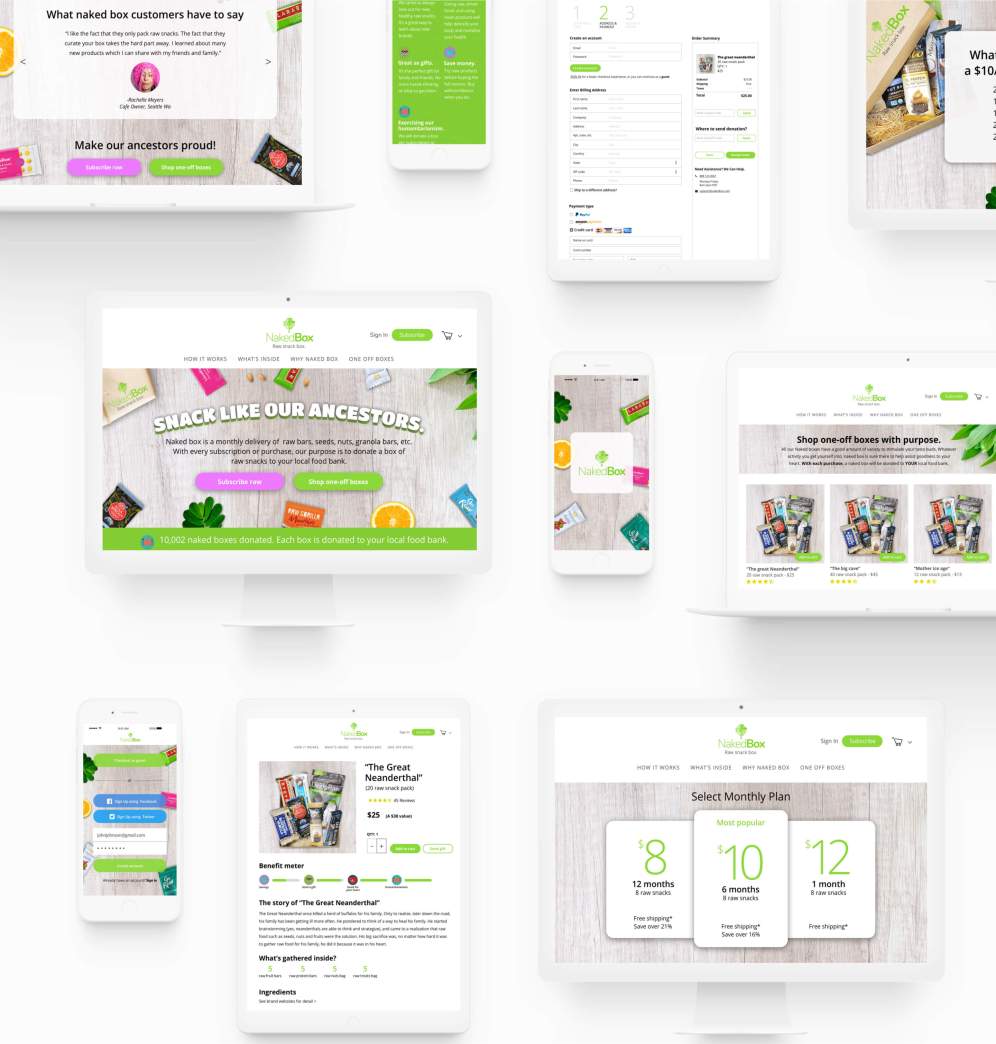
NakedBox is an e-commerce product selling raw
snacks. It focuses on monthly subscriptions or the
ability to purchase boxes individually.

InVision prototype
Overview

What is NakedBox?

NakedBox is a web and mobile product that introduces users to raw snacks through a monthly subscription or the ability to purchase boxes individually. The goal of NakedBox is to change how users eat, shop, and learn about raw snacks. The solution was brought to life through rigorous user research, ideation, testing and strategic visual elements.

The idea for NakedBox came from my love for food. Not just any food, but raw food! It is unprocessed raw food that can help revitalize the body and mind the purest way possible.

Problem

What is NakedBox
trying to solve?

It is safe to say that we all love to snack. From cookies, nuts, and even dried shrimp, everyone has their unique way to snack. In this health conscious world, users are now choosing healthy snacks over conventional.

When it comes to healthy snacking, there are many products out there which then leads a customer to decide. The research behind the thinking usually consists of the ingredient benefits and taste.

My challenge was to understand my users and to create a simple shopping experience that will eliminate decision-making and explore the benefits of raw snacks.

Solution

Passion.

Introduce users about raw products that are hand selected and curated inside a box. NakedBox changes the way snackers buy healthy products and learn about raw food. It allows users to subscribe to a monthly plan or purchase curated boxes that are shipped to their door. This eliminates decision-making, saves time, and saves money.

The making of NakedBox journey begins...

Discovery phase

User Survey

Get to know the users.

I created a user survey so I can find out exactly who my users were. I wanted to find out about their daily activities, their hobbies, and how they shop. These questions were shared through online forums, social media, and email and completed by 46 respondents.

Photo source: Pinterest

Photo source: Google

Here are some of my key discoveries through my surveys

66% stated that healthy snacks, including organics and raw food are too expensive.

26% of respondents shop online for healthy food.

82% are involved in some sort of exercise or sport activity.

67% stated they love to snack.

63% would snack healthier food than conventional.

73% of respondents stated there are too many organic products available to choose from.

76% stated eating raw food is the healthiest.

From the highlighted responses that I received, my conceptual spider-senses started to kick in. I then proceeded to interview a few people to create personas.

Personas

Held accountable by
our users.

To gain a deeper understanding of my users, I asked more in-depth questions to 3 users. I succeeded to gain interesting motivations and frustrations from the interviews.

Chris

Art Director

Age: 29 / Location: New York, Ny / Gender: Male

Motivation

Chris is a hardcore fixie bike rider. He rides down streets of New York for fun and for work commute. It gives him a rush. He chooses organic because he is OCD and putting potential pesticides in his system bothers him. He is a hipster and his hipster friends all eat organic, but he won’t go as far as being a vegan.

Frustration

Organic products are expensive

Biography

Chris likes to rok climb, bike, yoga, and snowboard. He moved from LA to NY and has been in NY for 5 years now. He loves the people and environment he is in. Outside and at the office. He loves whiskey, beer, and burritos. When he can, he chooses organic over conventional.

“I would choose organic over conventional if it was cheaper”

Kate

Photographer

Age: 25 / Location: Seattle, Wa / Gender: Female

Motivation

Kate is an expert Food blogger. She is mostly interested in Organic Products and non-GMO products. She doesn’t think much about conventional products in the grocery. She lives a healthy and active lifestyle and her love of organic food helps her even more with her health. She shops at Whole Foods and produces markets near her neighborhood. Kate is also a mother of 3 boys, and she is very much interested in feeding her kids organic food.

Frustration

Sometimes, there can be too many options to choose from. She would rather pick a product with a good reputation.

Biography

Kate lives in Pheonix, Az. She is 25 years old, and had just graduated from college. Currently, she is a food blogger and gets paid with paid advertisements. She looks after her 3 kids and often takes walks together. She is interested in organic snacks, fruits, and recipes. She loves to run and hike on her free time.

“I live to eat organic!”

Jake

Real Estate

Age: 32 / Location: Oakland, Ca / Gender: Male

Motivation

Jake cares a lot about his body. He takes Bikram yoga classes and applies it every morning he wakes up. He loves raw food. He thinks raw food will help him to be sharper in the mind and younger in the soul. He gets more energy putting better stuff in his system. He often finds himself giving his friends advice and tips on organic and raw eating. He wishes his friends and family a healthier eating habit.

Frustration

Jake find himself in the middle of Whole Foods and hesitating on picing an item over another. He wishes there was a simpler way to pick out good organic and raw products.

Biography

Jake works over 70 hours a week with his business and real estate. He has a very busy agenda. He needs to exercise and eat healthy to keep with his long hours of work and dedication. On his free time, he loves to watch movies, go to the museum and play golf with his buddies.

“I love organic, but just too many to choose from”

Competitive analysis

Where does it sit in
the market place?

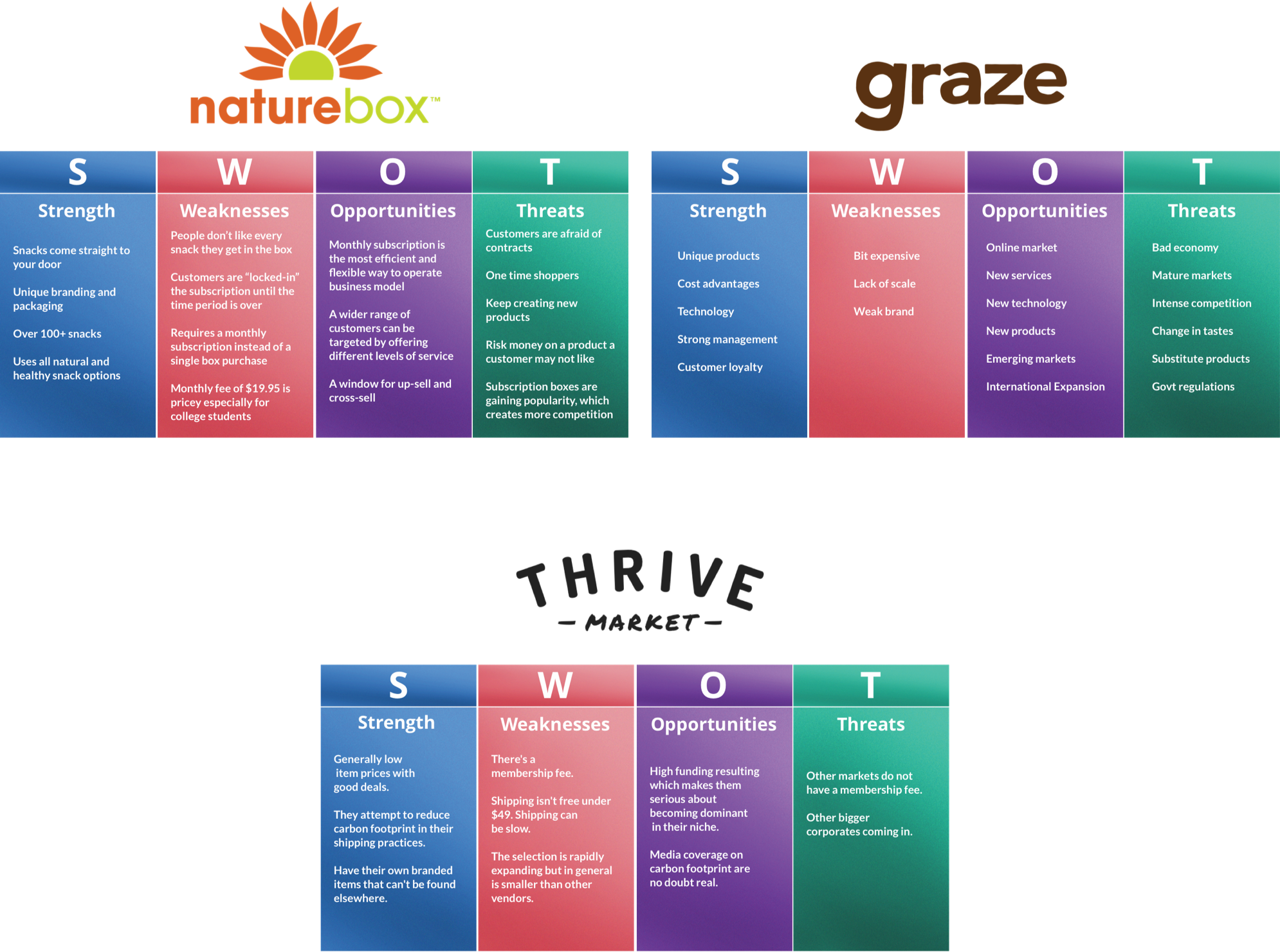
I started to look at some of the top organic and healthy food brands out there. I wanted to study how these brands are helping customers with their goals in terms of cost efficiency, healthy options, and products. First, Nature box seemed to be more of a market with subscriptions and curated boxes. Graze, on the other hand, is more geared towards subscriptions and other options as well like dips, jelly, etc. Thrive market has plentiful options and is more of a grocery membership online market. They claim to have many healthy options, but customers are left with questions on products they don’t know about. I realized quickly that there are many healthy options out there, and it can get pretty costly once everything sums up. Subscription boxes starting at a low monthly rate which includes samplers was the route I decided to take. I gathered my thoughts and started to concept built around subscription boxes and curated boxes for the sake of cost efficiency and simplified decision-making. Studying and comparing these brands gave me the insights to explore how I can bring super healthy food to a whole new level.

Branding & Identity

Concept & branding

The art of the idea.

My goal was to eliminate decision-making and my first initial concept was to create a healthy shopping experience based on editors and reviews. After doing multiple tests on Invisionapp user testing, users were confused to as what the my initial concept was selling. I created the test below and instructed the user to go about the goals. The video shows the user experiencing my initial concept and her frustrations.

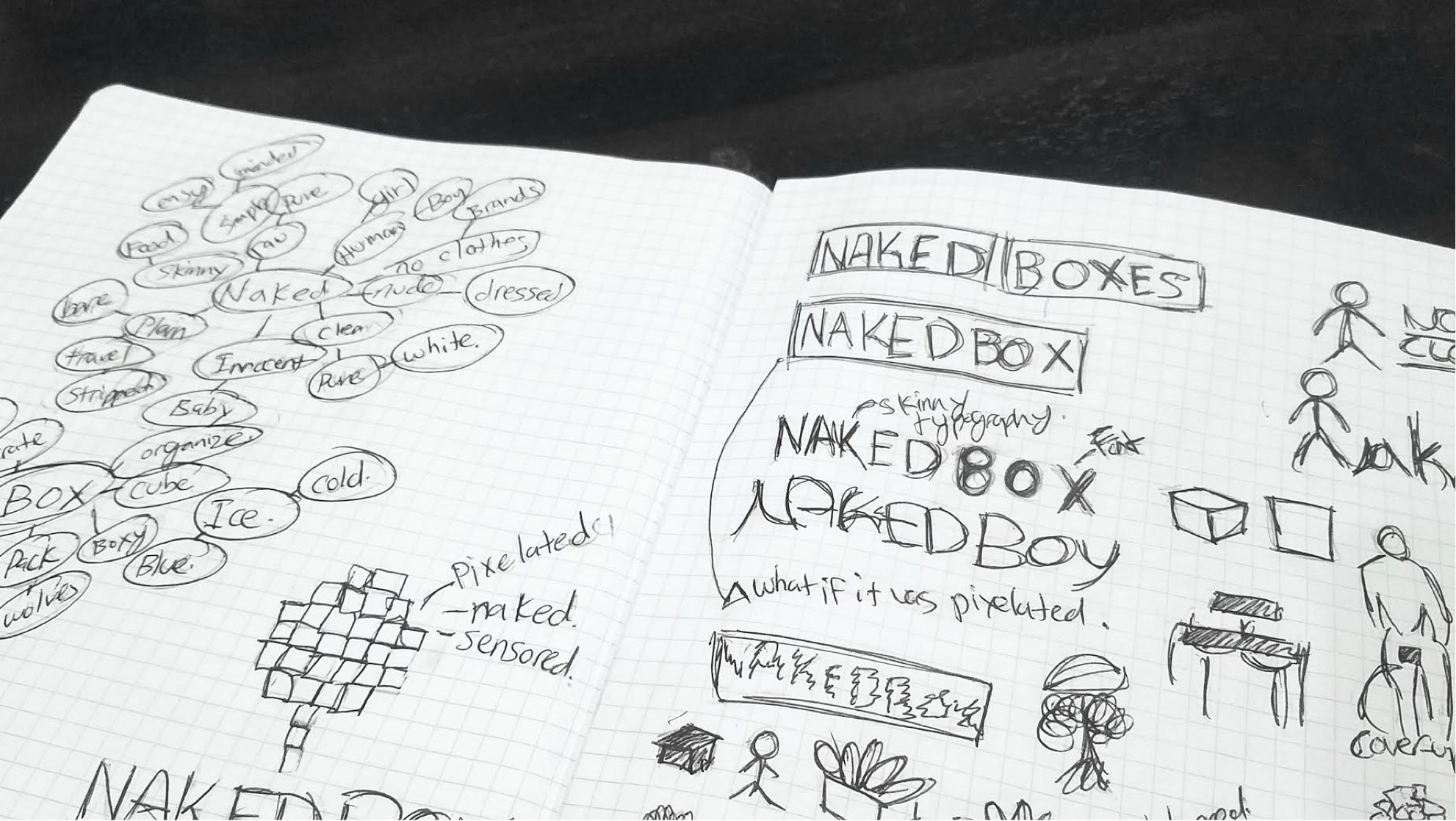
I learned from her experience as well as others. I then brainstormed several ideas until I landed on “NakedBox” which would sell raw snacks. The word “naked” would signify it’s simple and pure form of expression. Based on my research and competitive analysis, I have not seen any brand tapped into specializing in raw snacks. I also had the idea of having a donation part after purchases. The theme would be super healthy and minimal ingredient raw snacks in a box, at an efficient price that donates.

Information architecture

Defining the goals.

  • As a user, I want to learn about how Naked Box works?
  • As a user, I want to view monthly plans
  • As a user, I want to shop individual boxes
  • As a user, I want to select an item
  • As a user, I want to view details about a specific product
  • As a user, I want to add a box to my cart
  • As a user, I want to view my cart
  • As a user, I want to sign up for an account
  • As a user, I want to input my billing information
  • As a user, I want to pay for my items with a credit card, apple pay or PayPal
  • As a user, I want to sign up for an account
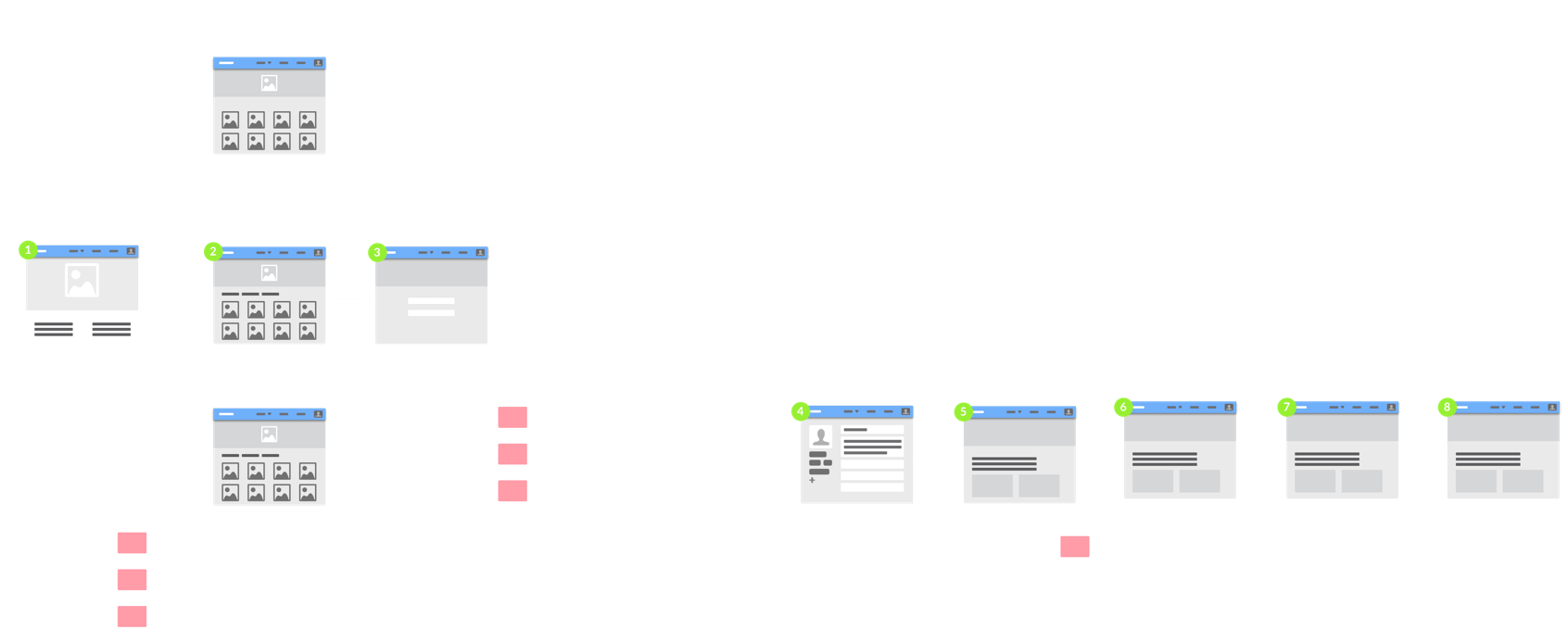
Paper prototype

Brainstorming with
paper and pen.

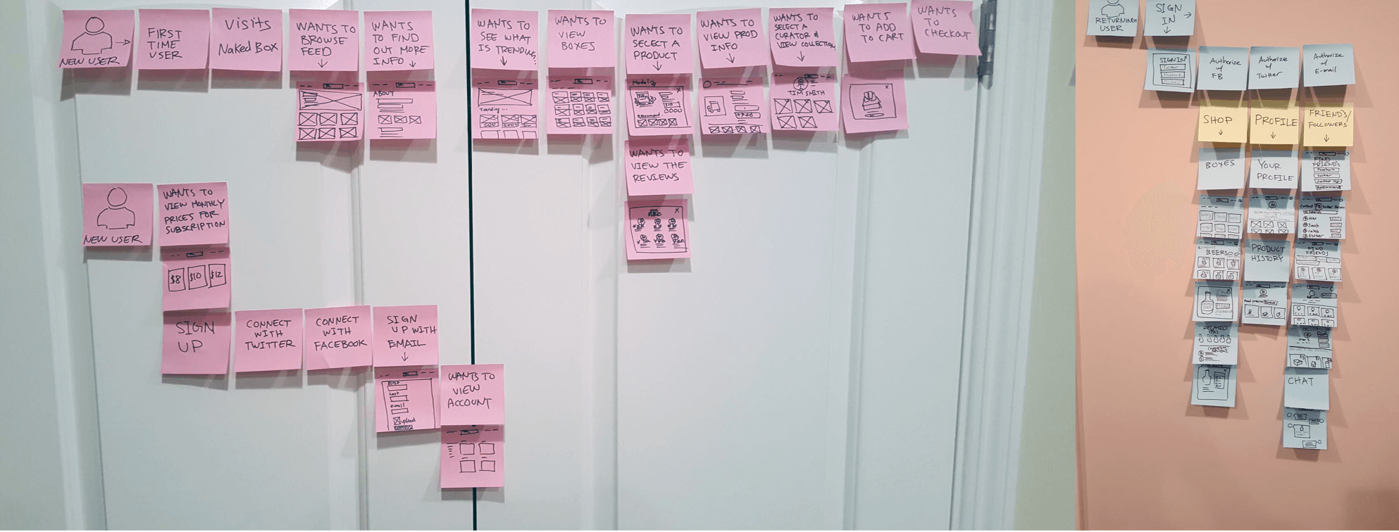
It’s quick, simple, and easy to throw away. I brainstormed how users would go through this site. I then walked users through the user flow. Users made comments about not liking to create accounts before checkout and payment. However, they understood when purchasing subscription plans, it was necessary to create an account. Another comment that I found interesting was, they would rather have a curated box and not spend time researching on products when “sending gift” or purchasing for themselves. Lastly, users were not too fond of adding friends and having a community, as it would be too much work and could get complicated. I gathered my thoughts together from my user’s feedback, and moved forward to creating user flows on Sketch design tool.

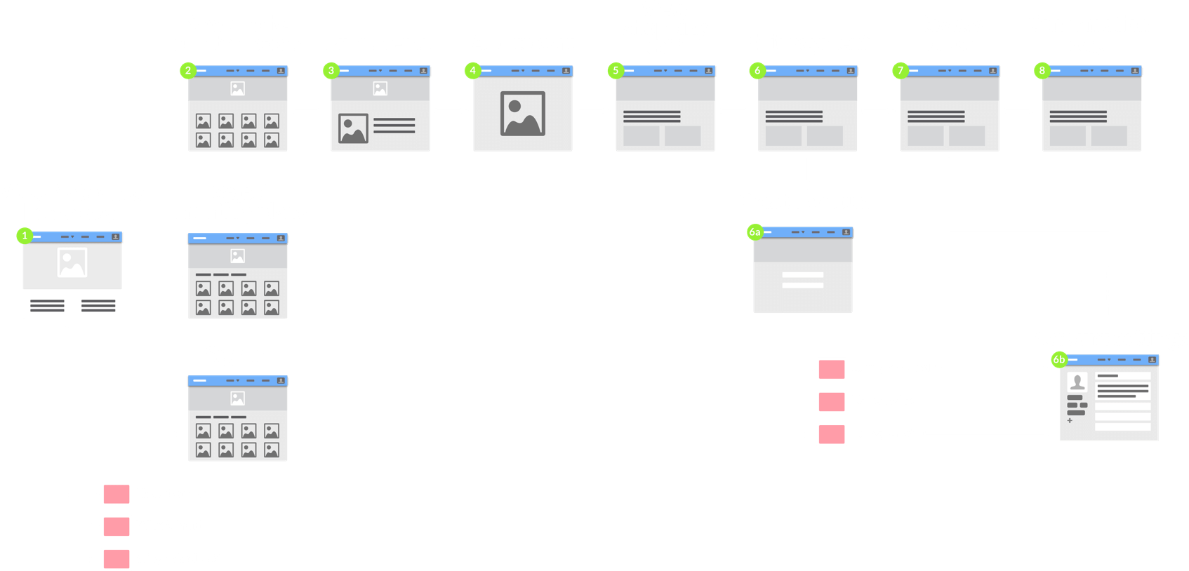
User flow using Sketch

Screen flow with precision.

The feedback from my paper prototype allowed me to make changes for a more refined user flow using Sketch. In Sketch, I created a user flow for “subscribing to a monthly plan” and “shopping individual boxes”. I then gathered a few users and talked them through each user flow. All the users seem to understand the process as it was clear and simple.

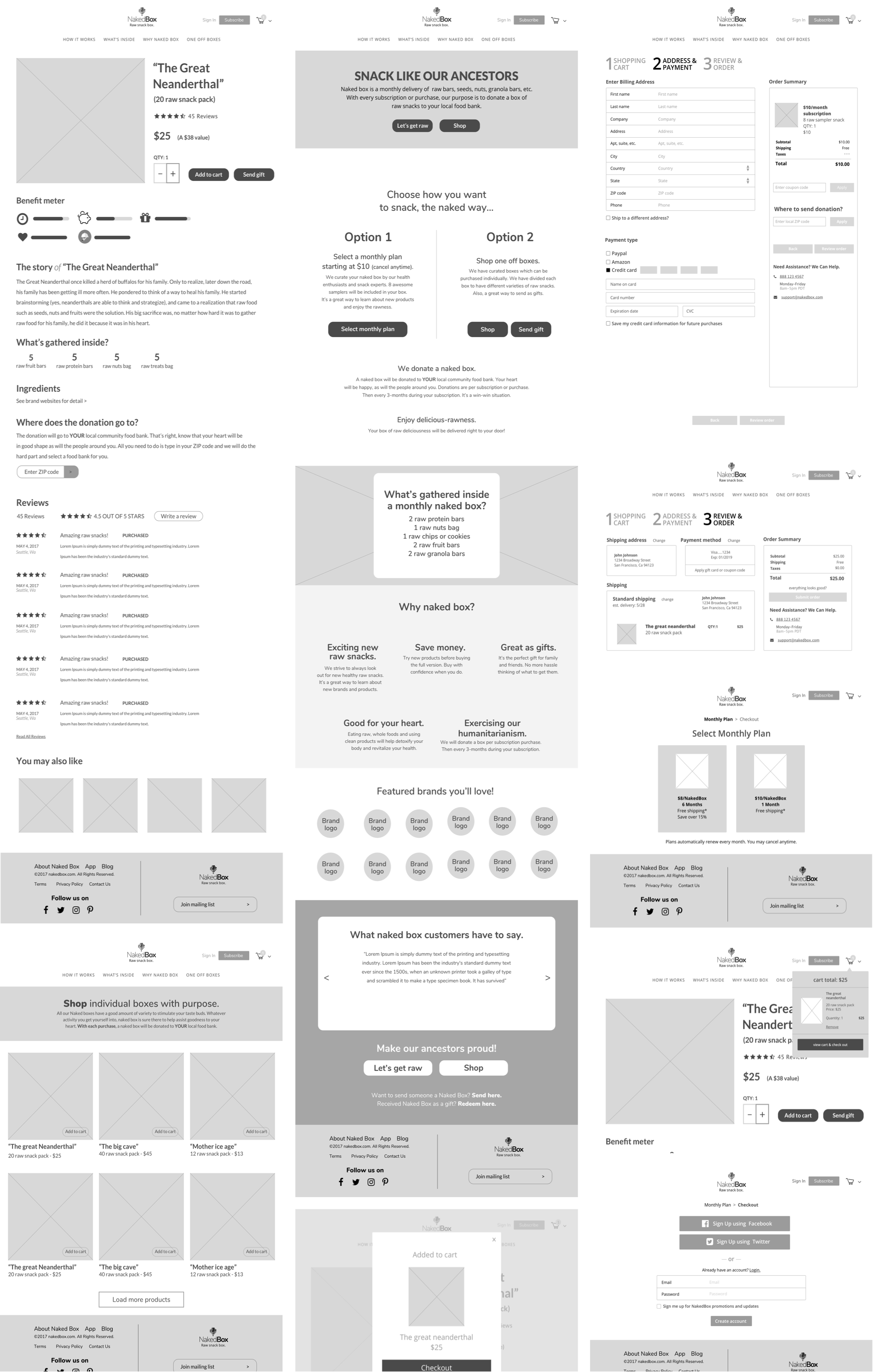
Hi-fidelity wireframes

Putting it all together.
Wire by wire.

One of the more popular highlights that arose from my user research and interviews was that they
all preferred to have a simplified shopping experience when shopping for healthy snacks.

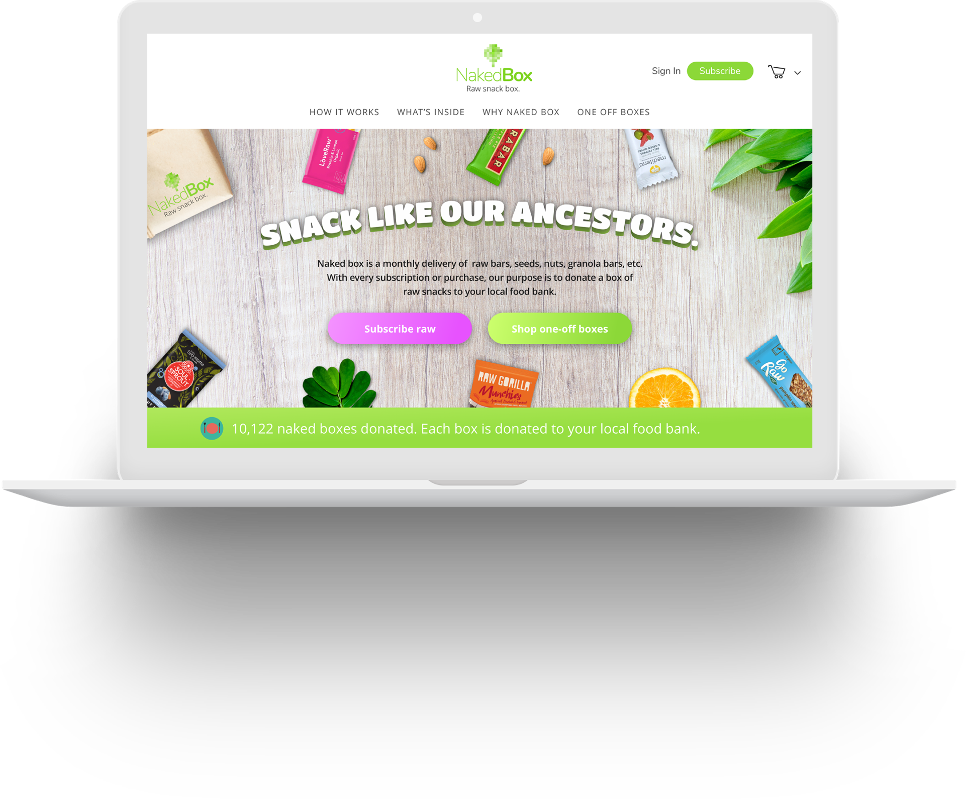
As a result, I made sure the design would incorporate something very simple. The homepage would say it all and as user’s scroll down, they would exactly know what this website is about. I made sure to include 2 CTA in the Hero section and also at the bottom so that users have the convenience of finding them. Creating a user experience that tells a story from beginning to end was my goal and it succeeded in my peek user testing.

User testing

What are users saying
about NakedBox?

I tested my wireframes in using Invision User testing and received a few 5-minute critiques from
real people. All users understood what the brand was selling and what it does.

Designing the product
detail page.

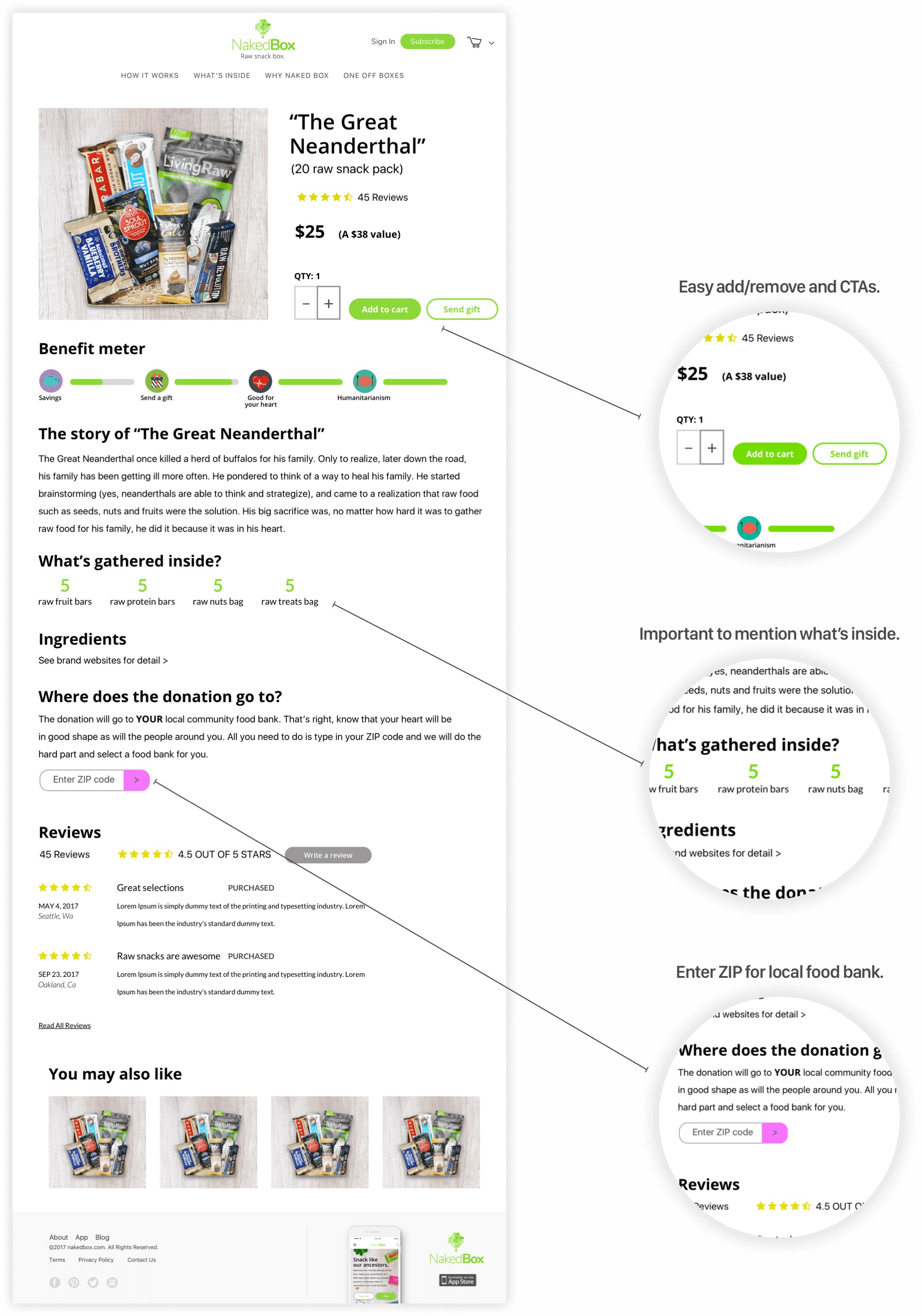
The product detail page is designed for easy CTAs, add and remove, reviews, story, etc. One topic that arose in my user testing is how the box gets donated to the food bank.

“Where does the box get donated to?”

“Can I donate to my local food bank?”

To answer these questions from users, I designed the product detail page to have a section of a ZIP code so users can input their location. I tested the product detail page out in Invisionapp and all users did not have a problem finding and inputting their ZIP code.

Designing the shopping cart.

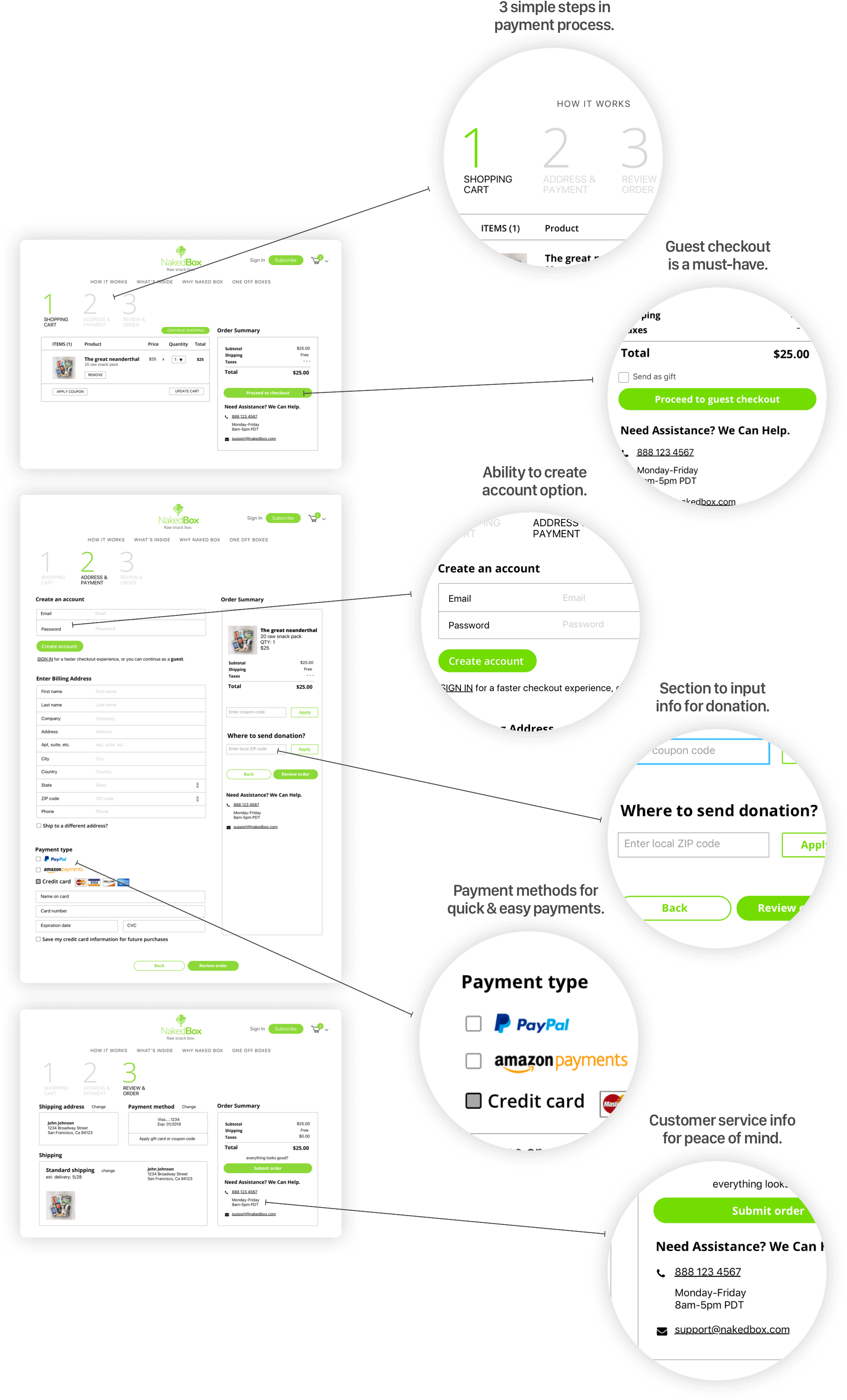
When I got to the shopping cart and checkout section, I created the user experience to be super friendly and convenient to the user. This isn’t your typical Amazon or eBay where account registration is favored. I needed to create the user experience so that it had a guest checkout, Amazon pay, apple pay, and if a user would like to register, then there is that option too. The white background and clean thin lines all create to give the user less clutter. I tested the flow of the shopping cart with Invision User testing and the results showed no frustrations.

Designing the homepage.

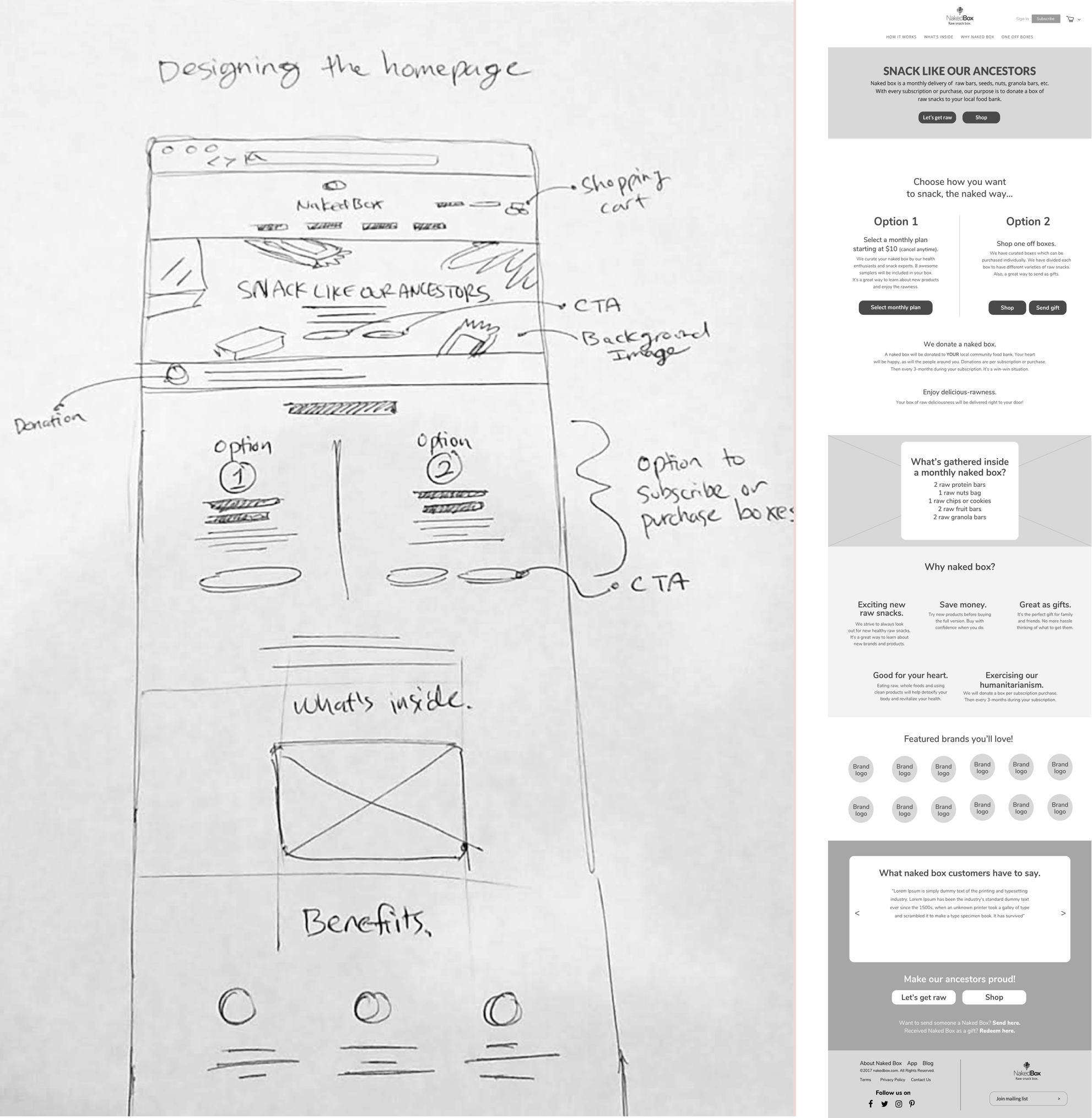
I started out with paper sketches to get a feel of how I would like the homepage to be designed. The design had to be clear and user-friendly. From my user research, I needed to design the homepage in a way a user would navigate and explore the benefits this product offers. The important factors are:

  • Strategic CTA placements
  • Show users how to subscribe and purchase individual boxes
  • How it works and how to pick different options
  • What’s inside a box?
  • Why NakedBox?
  • Brands that are sold
  • Testimonials and reviews from other users

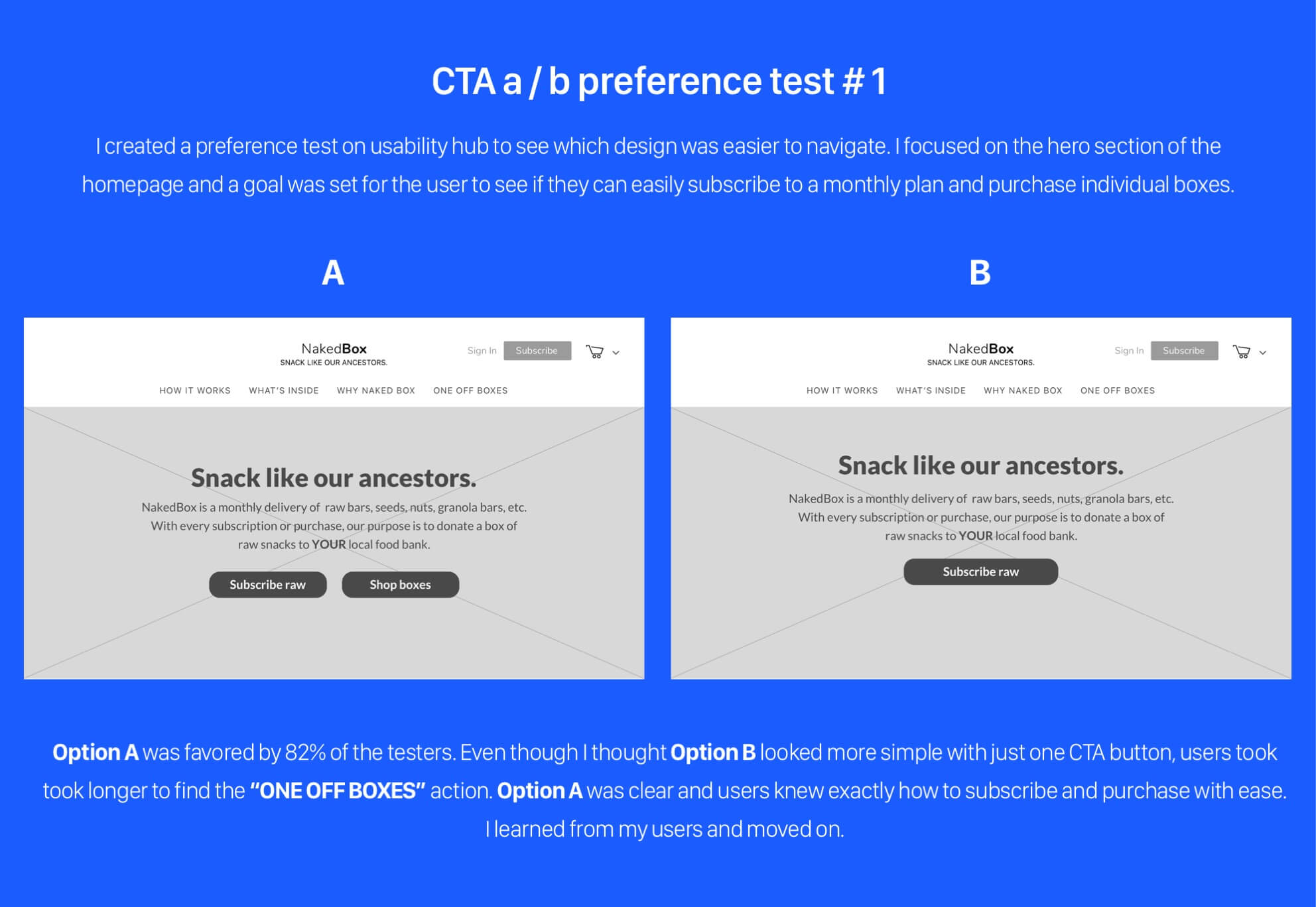
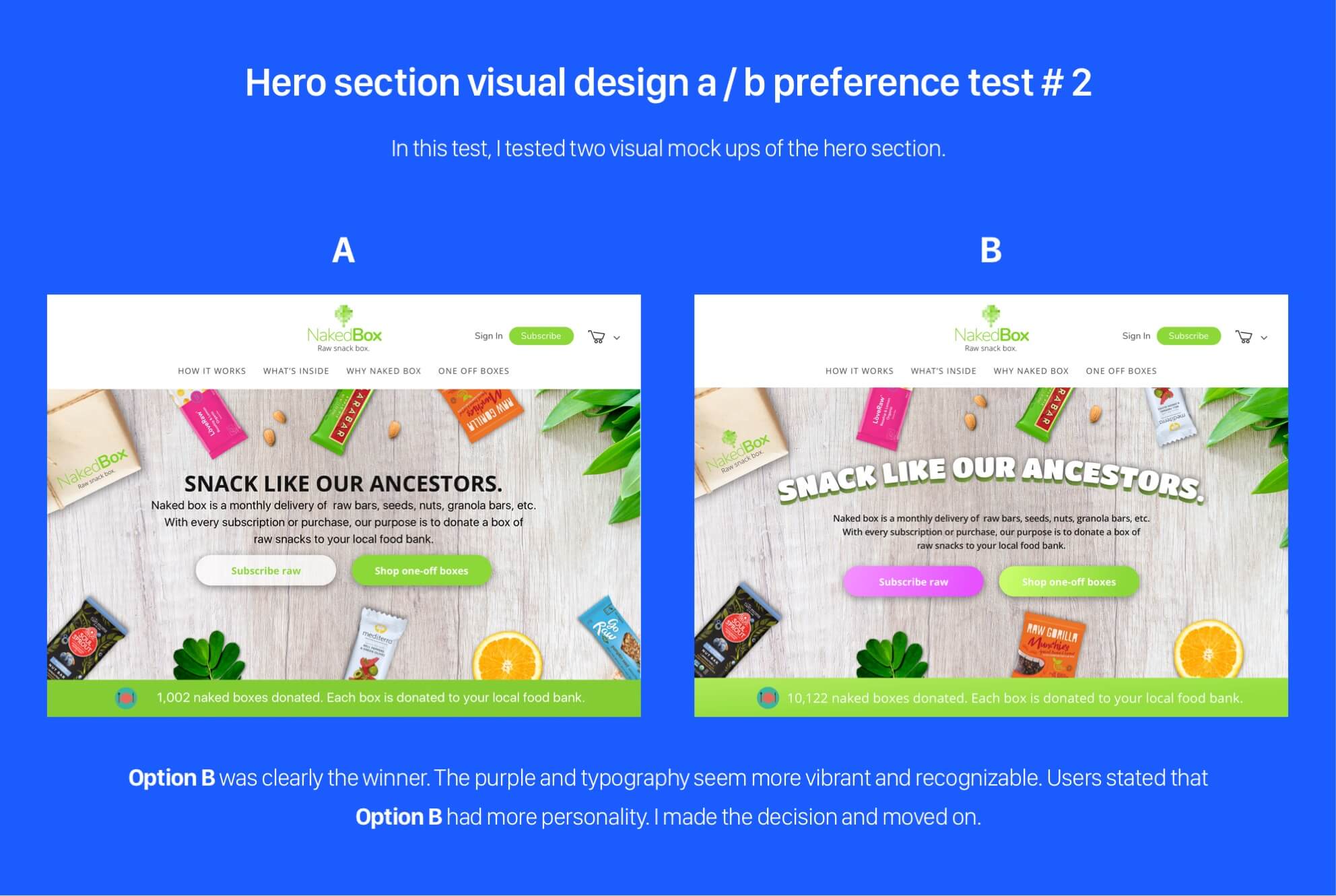
I conducted a couple of preference tests to see which design favored the most for the sake of user-friendliness.
I focused on the hero section.

I conducted a couple of preference tests to see which design favored the most for the sake of user-friendliness. I focused on the hero section.

Final homepage visual design

InVision prototype
Conclusion

What I learned.

Nakedbox is a project that has ultimately helped me become more confident as a generalist designer. I learned that the user research, surveys, competitive analysis, branding, user testing, and wireframing are ingredients in the design process that cannot be ignored. Coming from an Advertising and Visual Design background, one of the biggest lessons I learned was that as a designer, one should always test out an idea. Whether it’s in the concept phase or wireframe phase, it is absolutely vital to have user testing so that problems don’t show up in the final stages. I was corrected by my users, and I knew that even though I felt it was ok, it should never be one-sided or biased. When creating an experience, users are the first priority and our job is to give them a great one.

Overall, working on this project gave me some struggles, but from those struggles, I gained feasible solutions. That is where the learning started to happen. In considering further development, I would focus on having more variety of boxes sold individually to give users more options. I also see this as a real live product if marketed and developed well.
Back to Top
Grabbem

Grab, organize, and
share what you love.

Grabbem is a SaaS product that allows users to
grab and share content with an intuitive design.

VIEW CASE STUDY
Weekendr

More local fun.

Weekendr mobile app makes it easy to
find great local vacations within driving
distance of your town.

VIEW CASE STUDY