grabbem

Grab, organize, and
share what you love.

Grabbem is a SaaS (Software as a service) file-storage product that allows
users to grab and share content with a simple yet intuitive design.

View Invision prototype
Overview

What is Grabbem?

Grabbem is a cloud-based Saas (Software as a service) product providing users with a convenient way to collect and store information. Grabbem’s core value is giving the user the ability to categorize and save images, notes, and links with a simple yet functional design.

Problem

Information can provide inspiration, memories, and resources. It is our natural instinct to save them so we can remember them later. There are multiple Saas cloud-based sharing products available to users, often times these sharing platforms have confusing task management solutions and busy dashboards. They lack in simplicity and visibility when the user tries and categorize and tag content in a logical and searchable solution.

Solution

Grabbem aims to create a simple and intuitive user-friendly experience for users looking to collect images, notes, and links and have the ability to collaborate and share with others. The user has the ability to save any kind of content all in one place with the ability to categorize (tags) or by type (images, notes, and links).

Discovery phase

User Research

Get to know the users.

I started my research with a survey posted online to multiple media platforms, public forums, and email contacts. I wanted to understand what people were looking for in a cloud file-storage and sharing application, but also, their frustrations and what they currently use for storing information online.

View survey questions

Here are what I found out:

84% of respondents said when they find something worth keeping online, they save it.
  • 64% uses browser’s bookmark

  • 30%-40% uses Pinterest or Facebook

  • When asked what they like most about those tools?

    • “Easy to use”
    • “Simple and straightforward”
    • “It’s quick without switching to a different screen”

    When asked what they like least about those tools?

    • “Sometimes hard to find the information you want in random order”
    • “End up collecting too much resulting in unorganized content”
    • “Unable to group, tag or specifying a type”

    Other findings:

    73% uses a smartphone to browse

    65% uses a laptop
    News, social network, and media were among the highest in searches

    66% writes notes and saves them

    85% of respondents have a Facebook or Twitter account

    42% would use social media to sign up while the rest would register an account using email

    What I learned from the research

    It is safe to say that majority of users saves content and the way they do it is bookmarking in the browser. Frustration comes when users need to find their content due to disorganized information.

    I then interviewed 3 people to dig deeper into their experience
    with saving content and file-storage platforms.

    Luke

    Project Manager

    Age: 32 / Location: New York, Ny / Gender: Male

    Motivation

    Luke works at a construction site and develops many drafts in the software he uses. His software includes, Cad, Alias, Excel. He works on a construction site which allows him to walk a lot. Sometimes. if he forgets something in his vehicle to show his co-workers and emplyees, he would have to walk back to his car a long way. With the ease of gabbem, he could simply show on his laptop. He would love something that is something something simple and easay to use with the help of a cloud system.

    Frustration

    Forgetting documents in his car or home can cause waste of time to retrieve /
    Too many file sharing softwares which makes him undecisive on which one to use /
    softwares are not simple enough to use.

    “I need something that will always be there”

    Julie

    Data Analyst

    Age: 26 / Location: San Mareo, Ca / Gender: Female

    Motivation

    Julie is a Data analyst. She has many links, numbers and excel sheets to bookmark and save. She does sometimes get overwhelmed with the amount of data she has. She would like something that would help her organize and help het to take notes with ease.

    Frustration

    Hark to keep track and organize bookmarks /
    She forgets her passwords all the time /
    Organizing is time consuming.

    “I would love a note taker assistant!”

    Timothy

    Graphic Designer

    Age: 31 / Location: San Francisco, Ca / Gender: Male

    Motivation

    Timothy saves many browser links, videos, images, and photos. His job as a Designer motivates hit to gather many information the world offers. He needs a reliable and easy to use service that can quickly organize his information with ease. He also collaborates with his co-worker and friends and would like something that others can play abound with his designs.

    Frustration

    some softwares can get expensive /
    Some softwares doesn't offer the feaatures he needs /
    He tends to join the softwares with nice designs but not gis target audiance.

    “I need something that can handle all my information that offers great pricing”

    After interviewing three different users, three common goals came up.
    These goals will influence the design decisions.

    1. 1. Create a platform for users to save and organize content they can access anywhere
    2. 2. Create a simple yet intuitive dashboard design with visibility in navigation
    3. 3. Saving, simple notes, images, links and sharing with others should be quick and easy


    Competitive analysis

    Where does it sit in the market place?

    I started looking at some of the top cloud services on the market today. I studied their user needs, strengths, weaknesses, opportunities, and threats. I realized that these products all have their pros and cons. While Dropbox has their strength in their simplicity of use, low-visibility in file types in their dashboard can be frustrating.

    While Evernote is known for their note taking ability, their many features can come off as bloated and complex. I found Box to be more business and corporate targeted. Starting with that, I started to look for products built around “simple, yet functional”. Pinterest, Dribbble, Foodgawker, and Instagram all came to mind. Why not have a product built on these foundations and have the ability to have a cloud storage and collaborative nature all in the nature of functional, simplicity, and pleasing aesthetics.
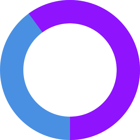
    When I asked what they like about their file-storage platform service

    • “It’s organized and can group content for easy find”
    • “Save big files and able to collaborate with others”

    When I asked what they like least about it

    • “Sometimes, the dashboard can have complicated task-management navigation”
    • “Low visibility in finding files”
    • “Some do not save links which I save a bunch of on my browser bookmark”

    Design focuses based off of user research & competitive analysis

    • 1. Design an intuitive dashboard where users can quickly add and save images, notes, and links.
    • 2. Create effective items and tags allowing users to get to their content quickly.
    • 3. Easy learning curve.
    • 4. Allow fast and easy access to the dashboard and get straight to the point.
    • 5. Provide a quick onboarding experience with the option to sign up with social media.
    • 6. Start off with MVP (minimum viable product) showcasing only the important features.

    Information Architecture

    User stories

    My next step in the design process was to create user stories to help determine and prioritize the important features to focus on users. These were created based only on the minimum viable product.

    • As a user I want to find out more about grabbem
    • As a user I want to create an account with email and password
    • As a user I want to create an account using Twitter
    • As a user I want to create an account using Facebook
    • As a user I want to view my content
    • As a user I want to view my favorites
    • As a user I want to create a group (box)
    • As a user I want to add a link
    • As a user I want to add an image
    • As a user I want to add a text-based note
    • As a user I want to select an item as favorite
    • As a user I want to share an item on Facebook
    • As a user I want to share an item on Twitter
    • As a user I want to share an item via email
    • As a user I want to add a collaborator
    • As a user I want to view my collaborators
    • As a user I want to manage my collaborators
    • As a user I want to add tags to my saved items
    • As a user I want to view a link
    • As a user I want to view an image
    • As a user I want to view a text-based note
    • As a user I want to upgrade my account
    • As a user I want to update my account settings

    User flows

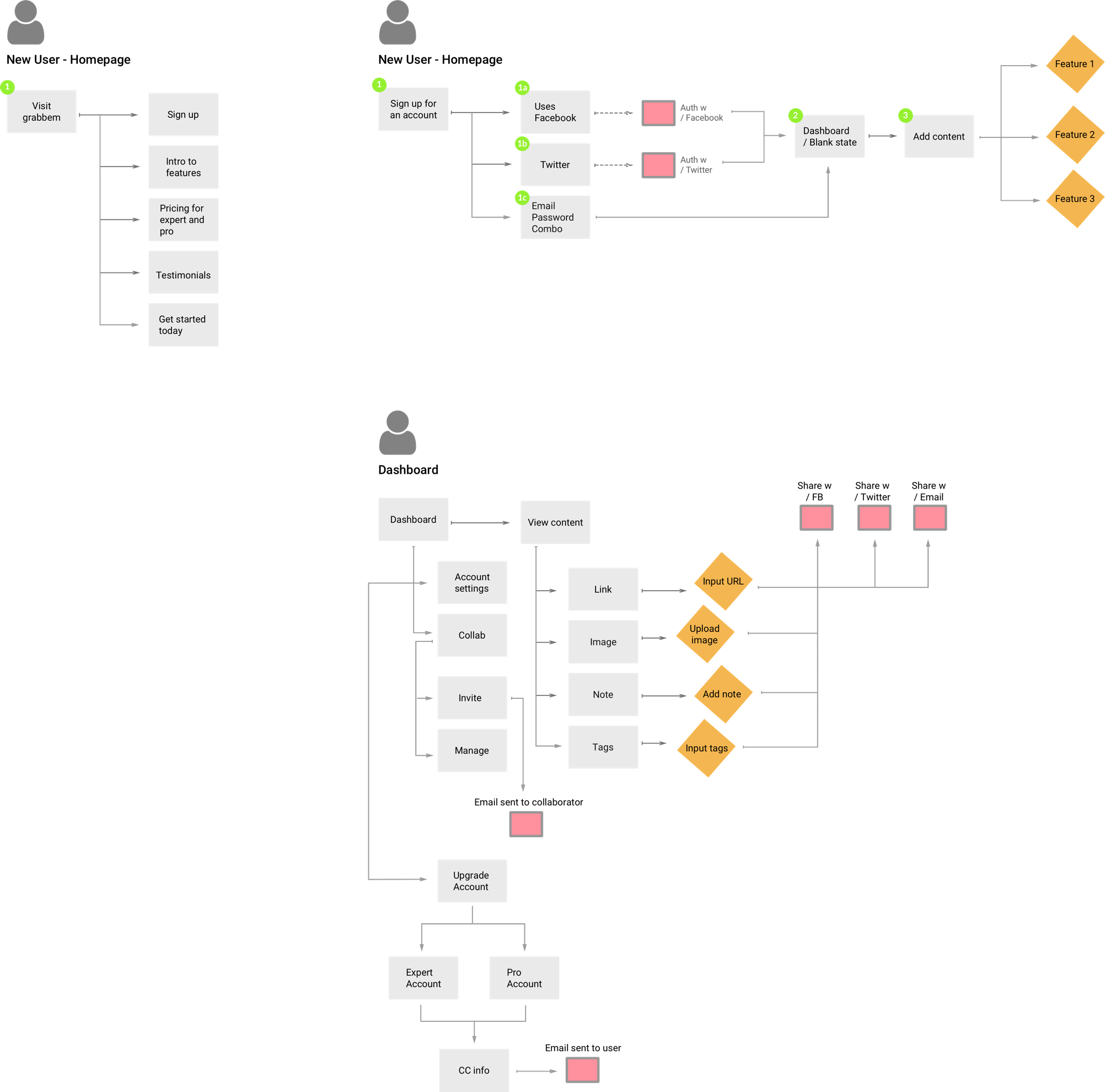
    From my user research, I created user flows in Sketch focusing on onboarding and dashboard.

    Branding & Identity

    Concept & Branding

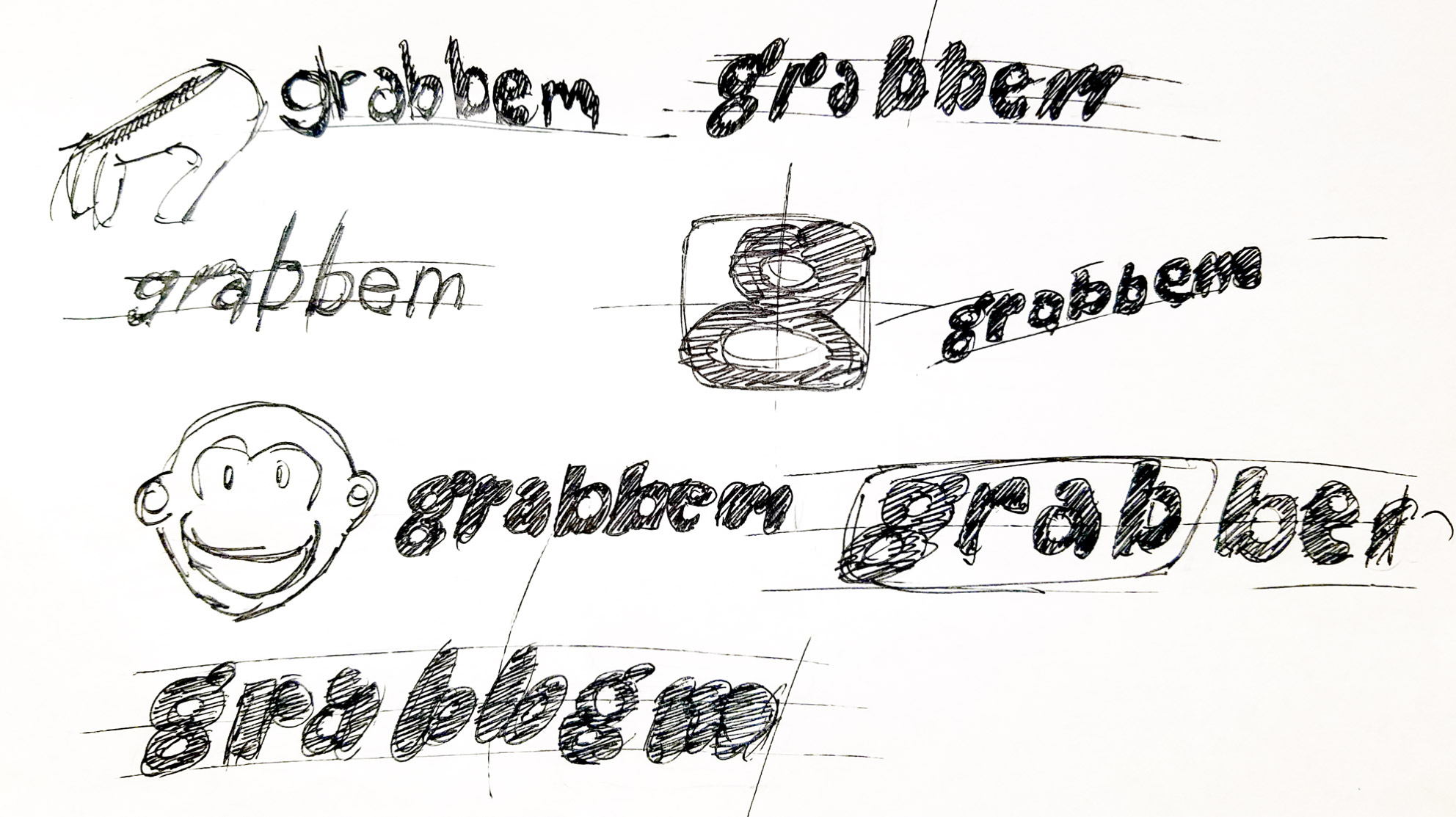
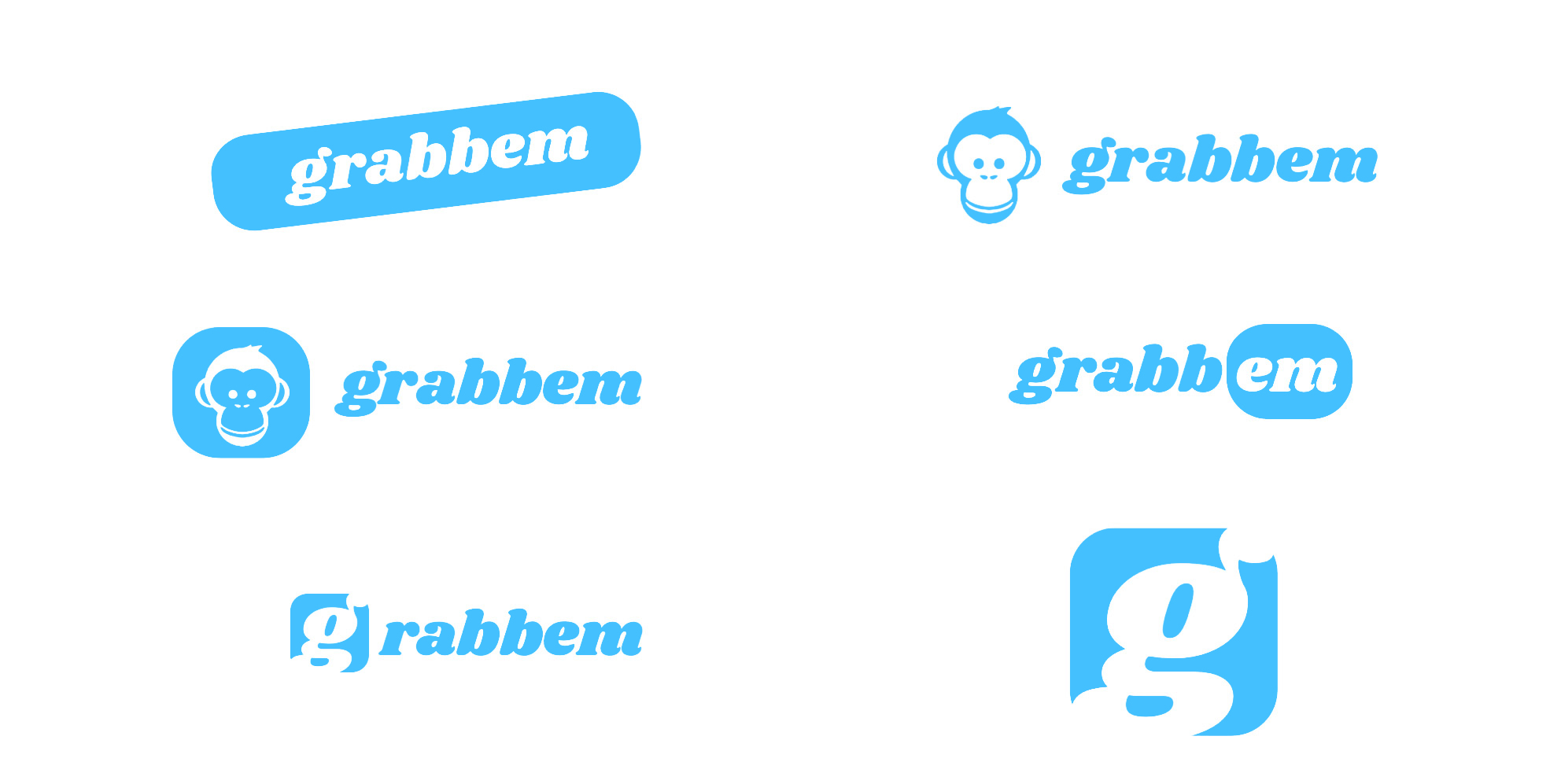
    When I got to the concept and branding phase, I wanted this product to have a catchy name. Pinterest, Dribbble, Dropbox are all memorable names and inspired me to make one as memorable. Eventually, I would land on grabbem. I wanted to associate a verb to entice action. I thought of a monkey grabbing a banana, a kid grabbing candy, an adult grabbing a drink, etc. In this case, users would be grabbing images, links, and notes.

    Grabbem identity is expressive and casual, but also trustworthy in the world of cloud storage.

    Color

    Blue was chosen for it's association with security. The high saturation was added to the blue to give it a certain unique tone. Grabbem identity is expensive and casual, but also trustworthy in the world of cloud storage.

    • #44C0FF

    Shrikhand - Logo Titillium Web - Headline Titillium Web - Body copy

    Wireframes

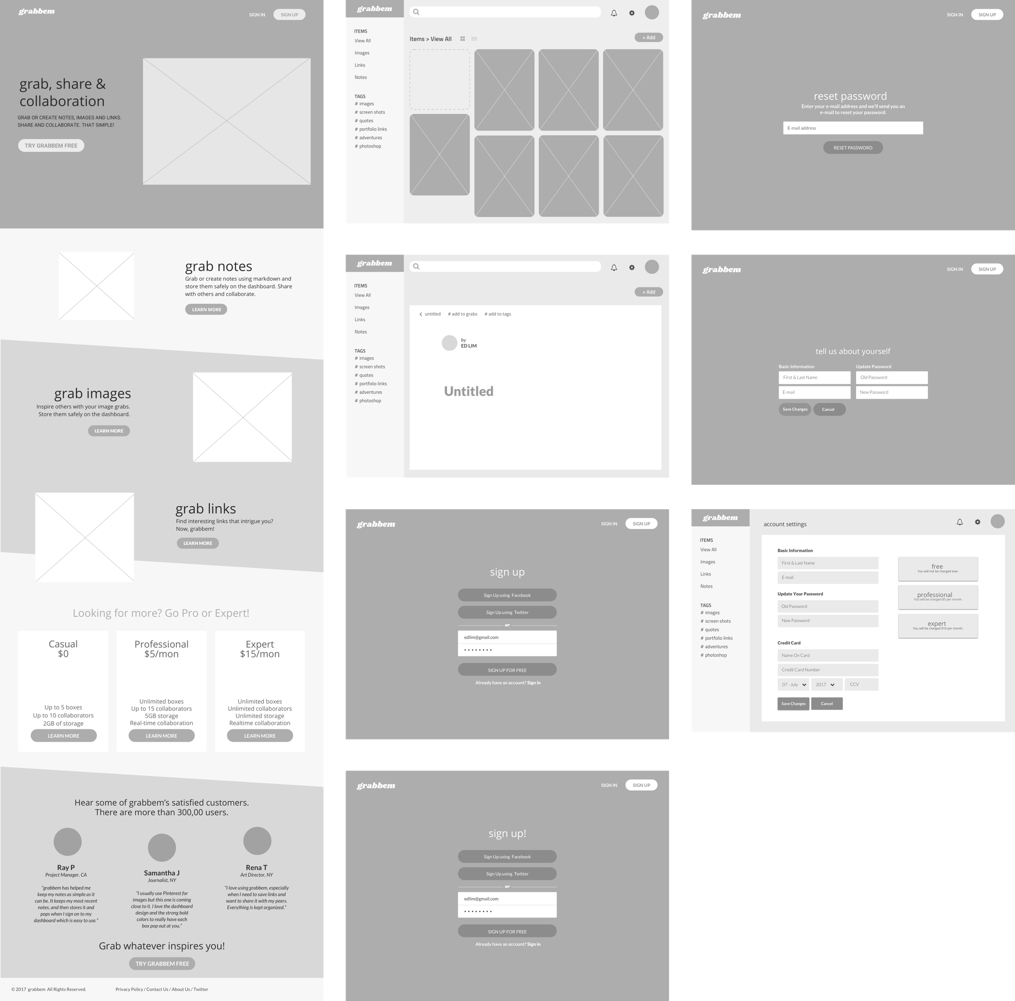
    I created wireframes to see the functionality of the product.

    Designing the dashboard and testing it.

    I talked about earlier about my design focuses based on my user research and competitive analysis. Here are the following:

    1. 1. Design an intuitive dashboard where users can quickly add and save images, notes, and links.
    2. 2. Create effective items and tags allowing users to get to their content quickly.
    3. 3. Easy learning curve.
    4. 4. Allow fast and easy access to the dashboard and get straight to the point.
    5. 5. Start off with MVP (minimum viable product) showcasing only the important features.

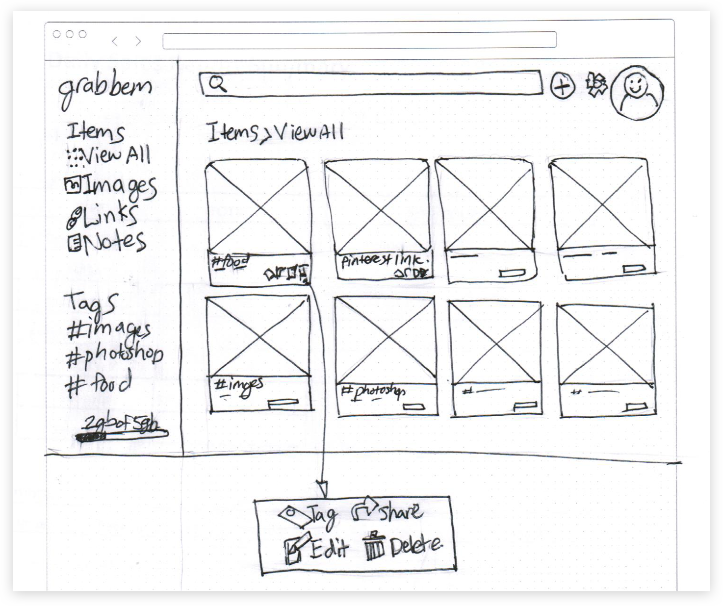
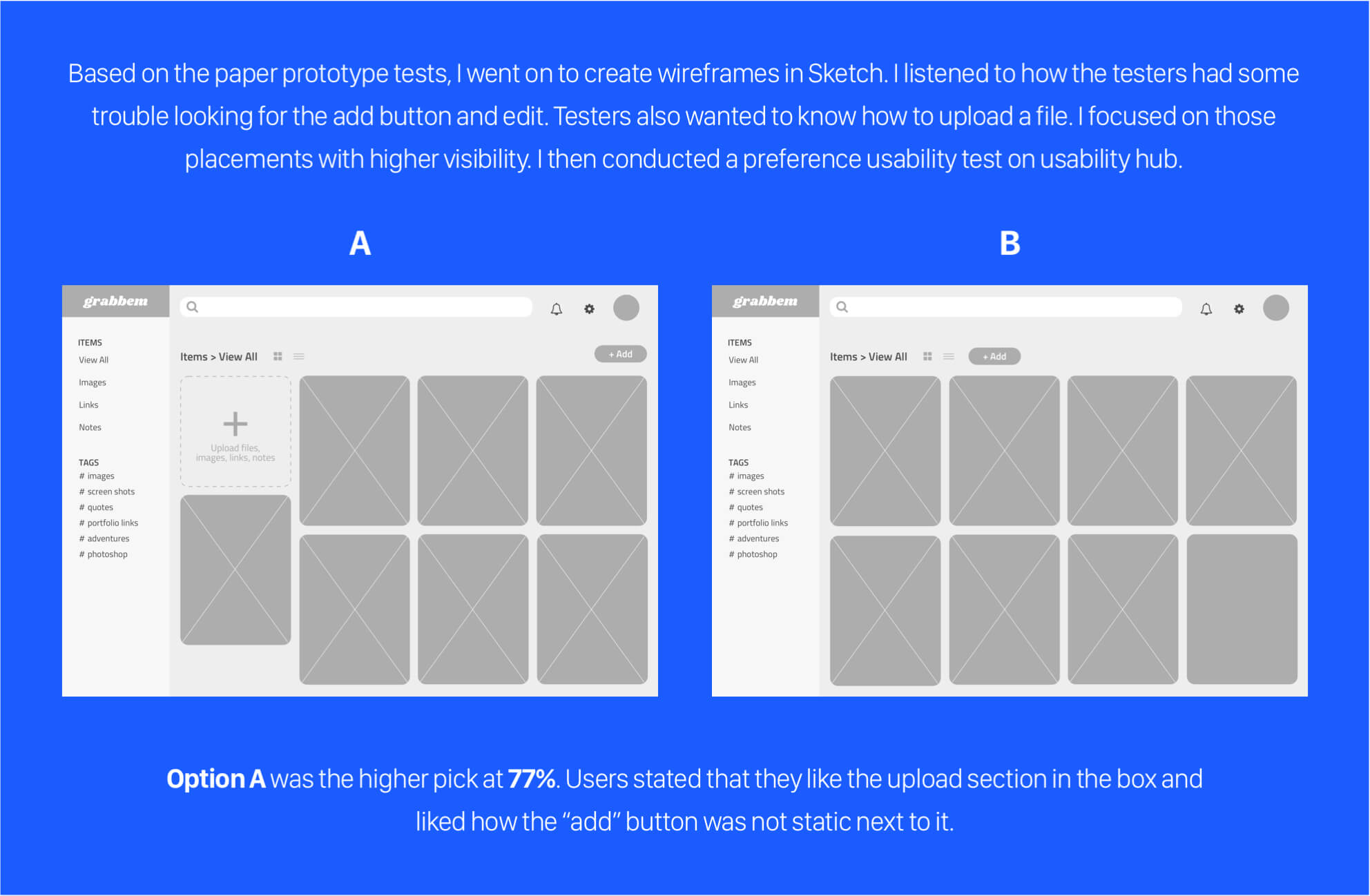
    I sketched freely on paper first to get a good grasp of how I wanted the layout to be. I tested them out to couple friends while watching a football game. I each got 5 minutes of their time for a beer each. I told them about the product and gave them certain goals to accomplish. Both testers found it fairly easy to navigate but had a hard time figuring out how to add images, notes, and links. They also had a problem on how to edit a file.

    Testers took way too long to notice the “add” button. They were also full of questions on what some functions do. I learned from this and moved on to do preference tests.

    Visual Design

    Dashboard

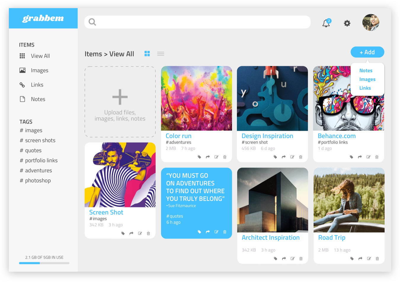
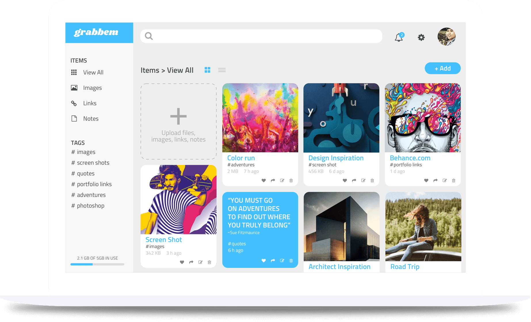
    The dashboard is laid out in an intuitive way so that each element of the dashboard is highly visible and easy to find. White space has been implemented for simplicity and space.

    Blank state

    Users are directed to a blank state and given the option to drag and drop or upload an image. I created a white space on this page so that users are not so distracted and they are able to accomplish their goals.

    Image upload

    Once an image is uploaded, users can add it as a tag, share, edit, or delete. The “x” on the top right corner indicates exit out of the window to improve user navigation.

    View Invision prototype
    Conclusion

    What I learned.

    This was an interesting project for me. I learned from my users in my user research phase about what their needs were and had I not, I would of had a hard time about which direction to go. There were many instances where I wanted to make this product super pretty and nice looking. After going through series of user testing, I made decisions based on the users. The user flow has definitely helped me plan my steps and decide easier about which steps to take.

    If given more time, I would team up with a group with an expertise in design, development, and business because I feel like this product has many opportunities to fulfill beyond the minimum viable product.

    Back to Top
    nakedbox

    Snack like our
    ancestors.

    NakedBox is a Web & mobile app e-commerce
    product focusing on either a subscription or the
    ability to purchase boxes individually.

    VIEW CASE STUDY
    Weekendr

    More local fun.

    Weekendr mobile app makes it easy to
    find great local vacations within driving
    distance of your town.

    VIEW CASE STUDY